But wait, it’s more than that
How stepping away from the Mac and gaining insight into a user’s daily routine transformed a feature into a tool that fostered multidisciplinary collaboration
Ask
Do what we hired you to do
Outcome
By going above and beyond, a large organization became more inspired to improve patients’ abilities to access healthcare.
The Situation
As a UX Strategist at OhioHealth, I helped teams make decisions by bringing the user’s voice into planning discussions. I was embedded with the UX Design and Product teams for the organization’s website and app. Despite ongoing efforts by the Product and Marketing teams to optimize and refresh the site, I felt we could do more to modernize and establish it as the patient’s front door.
Taking advantage of the ebbs in my work load—and sometimes working after hours during the flows—I began investigating what a modern web experience could look like.
Initial Planning
Before I even considered concepting a new experience, my curiosities first led me to investigate the foundation of how OhioHealth delivers a digital healthcare experience.
Taxonomy & Sitemap
I had often felt that the structure of the website was not conducive to common patient tasks. I first audited the site’s taxonomy to identify opportunities to envision one where patient utility better co-existed with informational content.
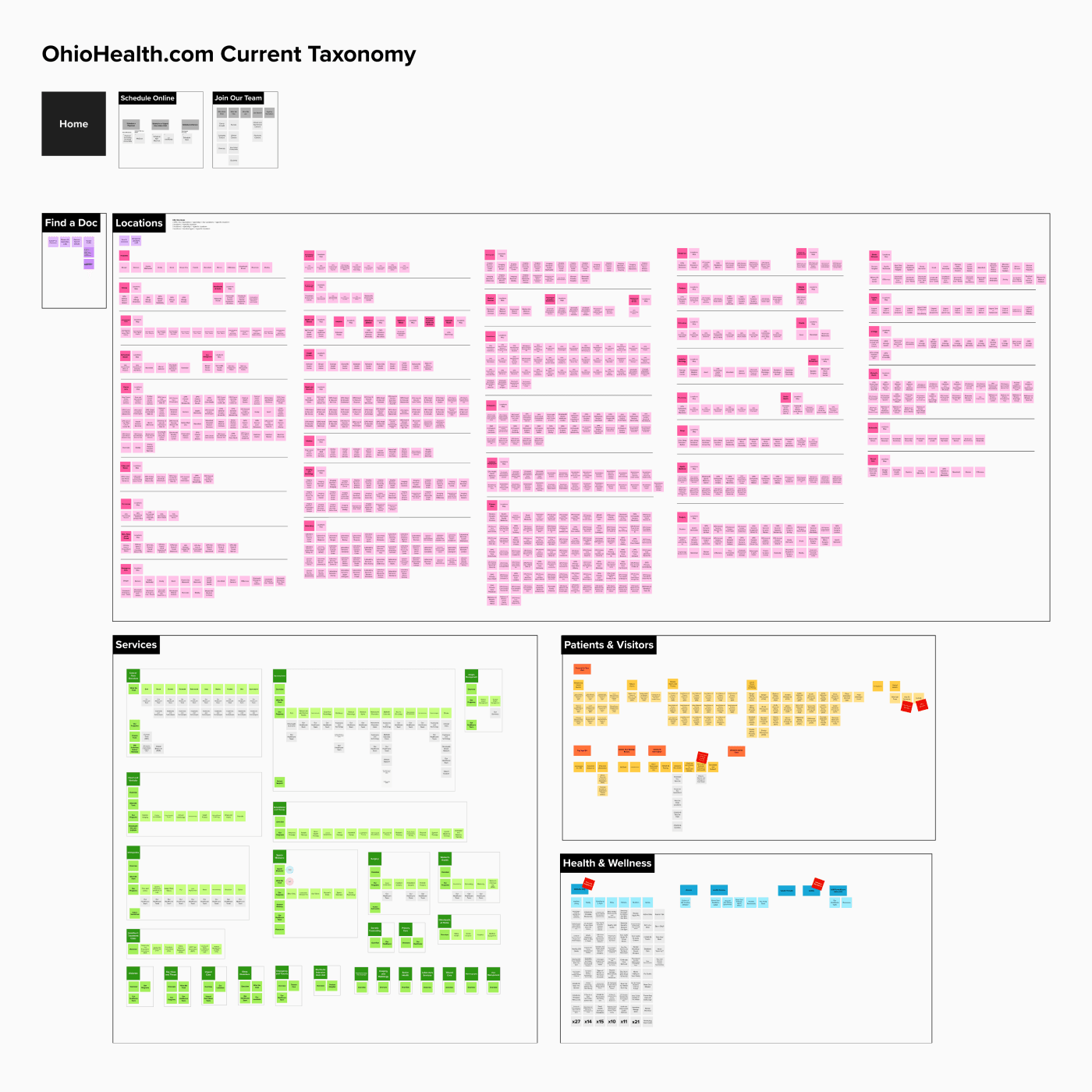
Audit of the existing site
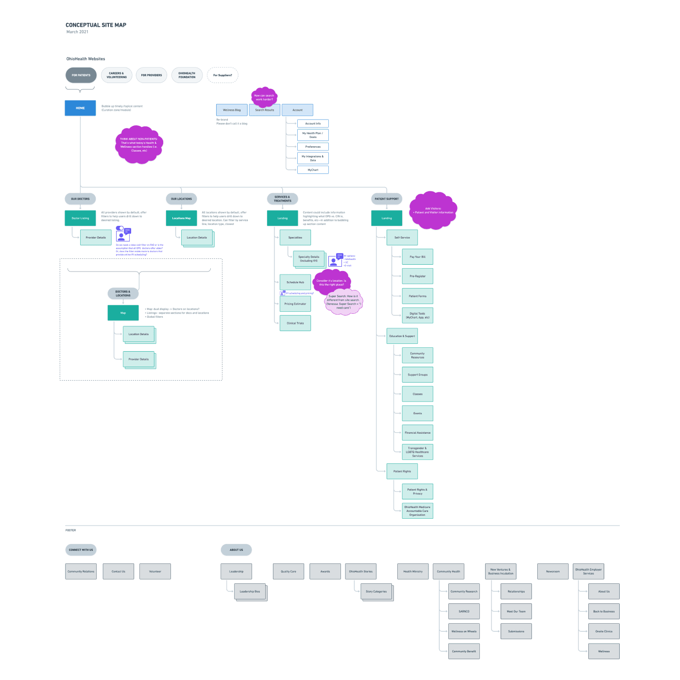
New conceptual sitemap
User Accounts & Profiles
Currently, signing into OhioHealth equates to signing into your MyChart—meaning, accounts are only for established patients. I felt there was an opportunity to reimagine user accounts as a mechanism to foster data portability across touchpoints—online and in-person. Additionally, by containing information beyond what’s in the health record, a personalized care journey could better be facilitated.
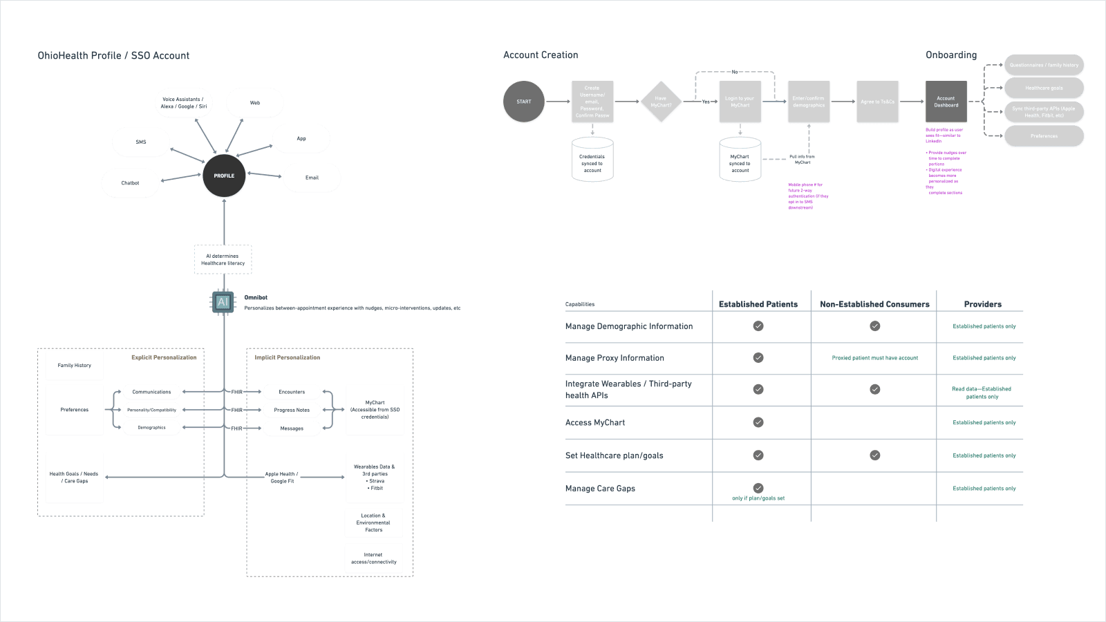
Thinking through how a profile could conceptually facilitate personalization across the site
Concepting
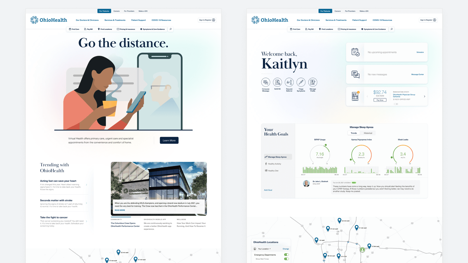
Anonymous & Authenticated Homepage
I explored a possible duality of the homepage of the website. For anonymous users, the homepage is more information while providing pathways into the health system. For established patients, evergreen content subsides behind a digital front door of their health journey.
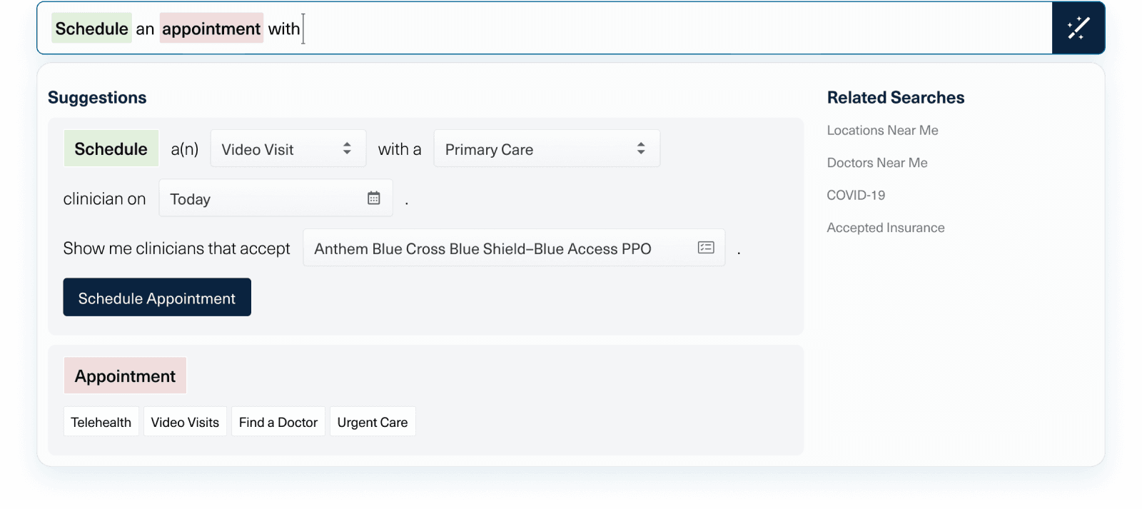
Type-Ahead Search
Search could be more than finding content. I explored the question, “What if search also helped users find actions they could take?”
Combined Provider Search & Scheduling
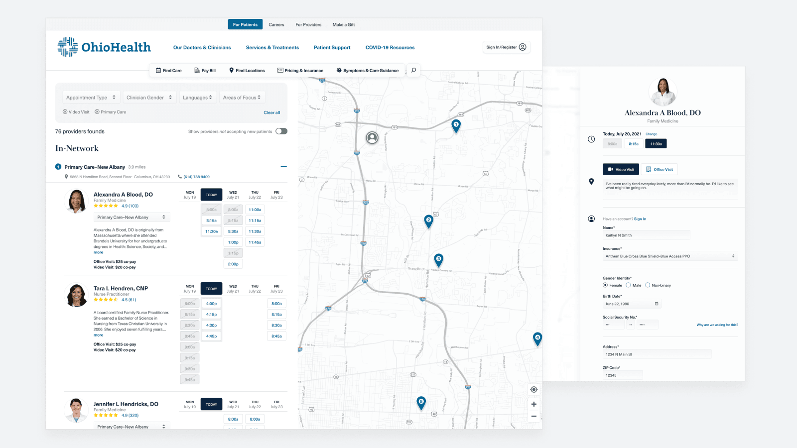
The current Find a Doctor experience was limited to, well, finding a doctor. I explored how we might take it one step further by allowing users to see a provider’s availability and schedule an appointment.
Outcomes
Gaining Allies
As the concept started to materialize, I shared it with our Product Manager. This began a snowball effect where we started having conversations with business partners and leadership, using this concept as the basis for facilitating those discussions.
Testing with Users
Because patient scheduling—and more specifically, allowing non-established patients the ability to schedule online—was becoming more of a business priority, the patient scheduling concept was prototyped and tested with users against the current Find a Doctor experience.
Results
With user tests showing clear preference for the concept and the desire to schedule online, the concept experience became a shipped-out feature.
This concept challenged the organization’s data stewardship. Without focusing on data optimization, experiences like the concept could never be rolled out. This served as the focal point to a traveling road show the UX team put together to highlight data needs to senior leaders.
The results of the user test also helped demonstrate to leaders that guest scheduling experiences were highly desired by prospective patients. By looking outside of MyChart, we could serve healthcare consumers and established patients.
©2024 Aaron J Cook. All rights reserved.
Let’s Talk